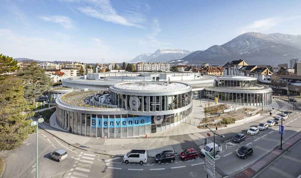
来源:谷德设计网
如有侵权,请联系删除

安纳西的老佛爷百货公司大楼是一座有些“唐突”和“无礼”的建筑遗产,在这座相对同质化的城市,它以其独特的历史而闻名。
商场最初被建造于城市边缘,后来被不断扩大的市中心吞并。在寻求其一直缺乏的文脉与城市品质的过程中,密集化的必要性逐渐凸显。最为重要的是,该项目需要转变为一个符合“市中心”定位的项目。
▼项目概览,Overall view © Luc Boegly
The Galeries Lafayette department store building in Annecy is one of those unexpected, almost insolent pieces of architectural heritage within an otherwise relatively homogenous town, notable for its unique history.
Initially on the edge of the city, the site had progressively been absorbed by an expanding city centre. The necessity for densification was clear in the quest for the contextuality and urban quality that it lacked. Most importantly, the project needed to be transformed into a ‘city-centre’ project.
▼既有建筑和场地鸟瞰
The existing building and site aerial view
在此背景下,该项目从很大程度上将既有的数个区域进行了重组,并使其变得现代,与此同时也进行了大规模的扩建,以容纳大约40家商店和餐厅,从而扩大老佛爷百货公司的建筑面积和经营范围。
In response to these factors, we have largely reorganised some of the existing areas in order to modernise them, but we have also created a large extension to accommodate around 40 shops and restaurants, thus expanding the floor space and range offered by Galeries Lafayette.
▼沿道路望向商场,View from the street level © Luc Boegly
容纳新店铺的卫星
SATELLITES HOUSING NEW STORES
面对既有建筑非常明显的圆形造型,设计团队并未给予否定,而是通过同样是圆形的新体量来拥抱它们。最终呈现出来的效果,使人完全感受不到它是与1970年代的建筑相独立的扩建部分,而是一座新设计的统一的现代建筑。
▼设计示意,Diagram © Manuelle Gautrand Architecture
▼项目模型,Model © Manuelle Gautrand Architecture
Faced with these very pronounced circular forms, we did not want to dismiss them, but rather to embrace them by working on extended volumes that were also circular. The final perception is not at all one of an existing 1970s building with an unrelated extension, but rather one of a unified architecture, completely redesigned and contemporary.
▼既有的环形停车场被新的圆形体量包围 © Luc Boegly
The existing car park is embraced by extended circular volumes
既有的停车场建筑拥有双层的环形体量,并建造在桩基上。这座建筑被保留下来,并通过自身的曲线造型将整个项目统一起来。自然而然地,其下方的空间被用于容纳新的入口商场以及大部分的公共空间及设施。
The existing car park, in the form of a two-storey ring resting on piles, has been preserved; its curve unifies the entire project, and it was a natural decision to make use of the space beneath it to install the Nouvelles Galeries entrance mall, as well as most of the public spaces and facilities.
▼建筑外观,Exterior view © Luc Boegly
▼入口层,Entrance level © Luc Boegly
从统一的空间中,数个圆形体量从既有停车场建筑的上方或下方“滑入”,犹如与环形相触碰的几颗晶莹剔透的卫星。这些“卫星”的直径各不相同,大都沿着场地与街道相接的位置布局,使项目更加醒目且具有招揽性。人们现在看到的不再是位于场地中心的环形停车场,而是充满吸引力的窗户、入口与餐厅露台。
From this unifying space, several circular volumes slip in above or beneath the existing volumes of the circular car parks; they are like delicate, crystalline satellites that have reproduced in contact with the rings. Variable in diameter, they are mostly arranged along the edges of the site in contact with the streets, making the project more visible and more welcoming; it is no longer the rings of the car park, tucked back at the centre of the site, that are initially visible, but instead the windows, entrances and café terraces that attract and lure in the public.
▼“卫星”的上下交错和偏移形成了露台空间 © Luc Boegly
The offset of the upper and lower satellites enables the creation of accessible roof terraces
沿着西侧、南侧和东南侧的外立面,五个类似的“卫星”分布在既有体量的周围。如今它们形成了一个以圆形体量为中心的星座,呈现出全新的规模和一种绝对现代的印象,使人无法分辨新与旧的界限。“卫星”的上下交错和偏移形成了露台空间,下方的空间获得了良好的遮阳效果。
Five of these satellites have been built around the existing volumes, along the west, south and south-east facades. They now form a constellation of circular volumes, in which you can no longer tell which are old and which are new; the project takes on a whole new magnitude and gives the impression of absolute modernity. The offset of the upper and lower satellites also enables the creation of accessible roof terraces, while the spaces below benefit from solar shading.
▼建筑立面,Facade © Luc Boegly
▼首层公共区域,Public area on the ground floor © Luc Boegly
▼商场销售区域,Retail area © Luc Boegly
▼餐厅,Cafe © Luc Boegly
多孔的褶皱外墙
POROUS & PLEATED FACADES
一系列圆形体量均采用玻璃幕墙作为外立面。
它们犹如玻璃材质的褶皱,与停车场大圆环的镂空预制混凝土外墙相呼应,形成了一种近乎动态的效果。有规律的垂直元素为弧形的体量增添了优雅与动感。
The outer facades of these great circular forms are fully glazed.
Like glass pleats, they echo the concrete pleating that encloses the large rings of the car parks, whose openwork facade structure is formed of curved sections of precast concrete installed vertically around the rings. The effect is almost kinetic, distinguished by a regular vertical rhythm that gives an elegance and dynamism to the curving forms.
▼建筑外观,Exterior view © Luc Boegly
▼立面近景,Facade close-up view © Luc Boegly
围绕着大尺寸玻璃面板的外壳采用灰色阳极氧化铝制造,呈现出中性又明亮的观感,并带有微妙的反射效果。位于后方立面的展示橱窗很好地利用了这些褶皱,能够突出展示效果,增加自身的可见度。
The envelopes encasing the large glazing panels are in grey anodised aluminium, a shade that is both neutral and luminous, creating a subtle play of reflections. The display windows to the rear can play on these folds, dramatizing their effects, increasing their visibility.
▼店铺橱窗,Display windows © Luc Boegly
▼建筑外观,Exterior view © Luc Boegly
得益于翻新和扩建,该项目将获得英国建筑性能评估体系(BREEAM)的优秀级认证。
The project was able to benefit from the renovation and extension to achieve BREEAM Excellent certification.
▼建筑夜景,Night view © Luc Boegly
▼沿道路视角,View from the roadway © Luc Boegly
▼场地平面,Site plan © Manuelle Gautrand Architecture
▼首层平面图,Plan RDC © Manuelle Gautrand Architecture
▼立面图1,Elevation 1 © Manuelle Gautrand Architecture
▼立面图2,Elevation 2 © Manuelle Gautrand Architecture
TECHNICAL FACTS :
PROJECT :
Restructuring and extension of the Galeries Lafayette department store in Annecy by creating a «mall» and small and medium-sized retail areas. Restructuring of the parking lot and landscaping
PROGRAM :
A department store (existing), small and medium-sized shops, restaurants, bicycle and car parking
ARCHITECT :
MANUELLE GAUTRAND ARCHITECTURE
INTERIOR DESIGN :
STUDIO DAVID THULSTRUP (DK)
OWNER & INVESTOR :
CITYNOVE – GROUPE GALERIES LAFAYETTE
PROMOTER & CONSTRUCTOR :
LEGENDRE DEVELOPPEMENT
DESIGN TEAM :
KHEPHREN: structural engineers
T/E/S/S: facades engineers
BARBANEL: M & E engineers
VPEAS: quantity surveyors
SURFACE:
Existing surface : 17.500 m²
Created surface : 10.000 m²
Final surface : 27.500 m²
ECOLOGICAL-CONCEPTION :
BREEAM label, level «excellent»
DATES :
Studies : 2011 – 2018
Construction phase : 2019- 2022
Closed and covered delivery : summer 2022
Tenants installation : 2022-2023
Final delivery : summer 2023.